Make a Pie Chart
plotPieChart.RdMake a Pie Chart
plotPieChart(
  value,
  group,
  legendName = deparse(substitute(group)),
  legendLabels = if (is.factor(group)) levels(group) else unique(group),
  legendColors = NULL,
  showAxisText = TRUE,
  showAxisTicks = showAxisText,
  asPercentages = TRUE,
  palette = getGraphOption("palette"),
  ...
)
Arguments
- value
The value for each group.
- group
Character of factor that indicates which value belongs to which group.
- legendName
Character, title of the legend.
- legendLabels
Character vector with names for the legend.
- legendColors
Character vector with colors.
- showAxisText
Logical, should the axis text be shown?
- showAxisTicks
Logical, should the ticks on the polar coordinates be shown?
- asPercentages
Logical, should value be transformed to percentages? Recommended to be true.
- palette
Character vector with palette name. If this option is set then legendColors is ignored. If palette is NULL then legendColors are used.
- ...
Arguments to be passed to
themeJasp.
Value
a ggplot object.
Examples
library(ggplot2)
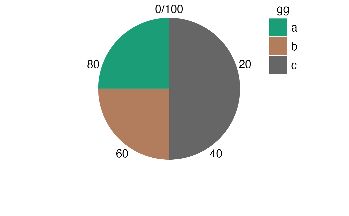
value <- c(25, 25, 50)
gg <- letters[1:3]
ga <- letters[4:6]

g <- plotPieChart(value, gg)
print(g)

plotPieChart(value, gg, ga)

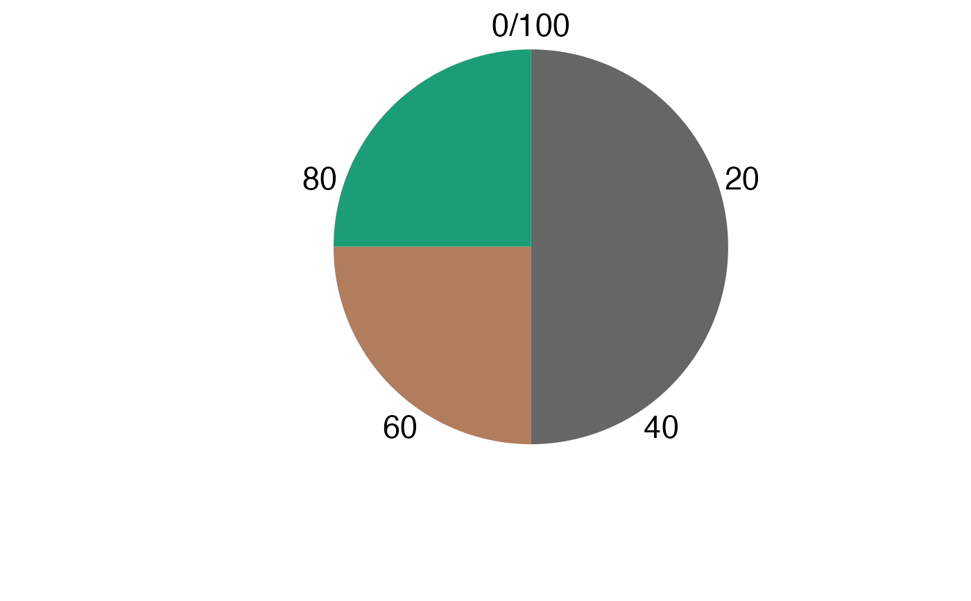
plotPieChart(value, gg, ga, showAxisTicks = FALSE)

plotPieChart(value, gg, ga, showAxisTicks = FALSE, legend.position = "none") # hide the legend


# axis can still be modified
print(g + scale_y_continuous(breaks = c(50, 75, 0)))

print(g + scale_y_continuous(breaks = seq(0, 100, 10)))

cm <- c(0, cumsum(value))
breaks <- 100 - (cm[-1] + cm[-length(cm)]) / 2
print(g + scale_y_continuous(breaks = breaks, labels = gg))


# something more extreme:
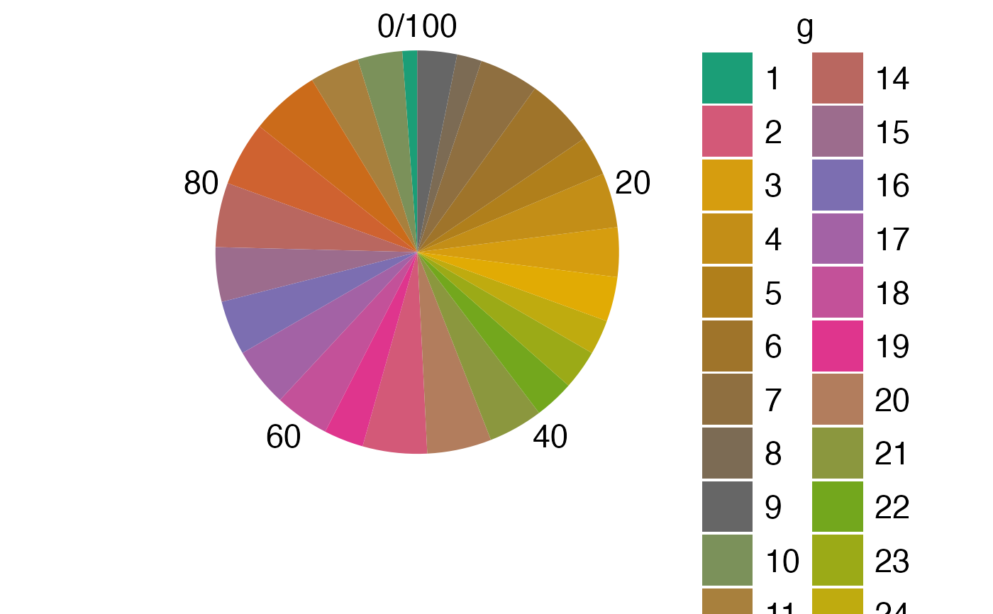
value <- rpois(25, 10)
g <- as.character(seq_len(25))
plotPieChart(value, g)
